

Advanced Graphing in Excel
- John Hansler
- Jul 12, 2025
- 2 min read

Updated: Jul 13, 2025
Today, I want to write a bit about some more advanced graphing ideas in Excel. Generally, if you know these are available as options, they are pretty easy to implement. Once again, the Excel files are included as a download.
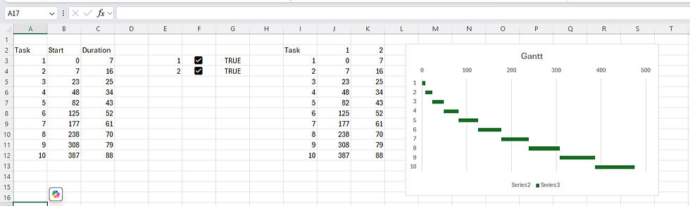
First, using checkboxes to plot series selectively. Basically, once you have some data set, insert checkboxes, then use an IF statement to link the data set back to either NA or the original values. The checkboxes when checked act as TRUE in the IF statement, so when unselected, NA values will pop up and remove the data series from the plot. See below. You can also use a number of other tools, such as list boxes to do the same thing.


Next, creating a Gantt chart. This is basically used for project timelines. You need to insert a stacked bar chart. Use no fill to hide the data series (right click on series, fill, no fill). Then invert the categories in format axis (right click). See below. You don't need the checkboxes here, but you can include them if you want to highlight certain tasks (you would need to reformat them, obviously).
Next, a waterfall chart. Basically, we select our data and insert a waterfall chart in all charts. The only adjustment is to right click on the EBITDA and EBIT and format the data points to set them as totals.

Now, you can also create sunburst charts and treemaps. The only thing you need to know is how to format your data tables, which you can see below. So, it's relatively straightforward and I won't comment on them much. For treemaps I format the data series to have a banner. Similarly, world maps can also be created. You can also fiddle around and add things like 3d projections onto them.
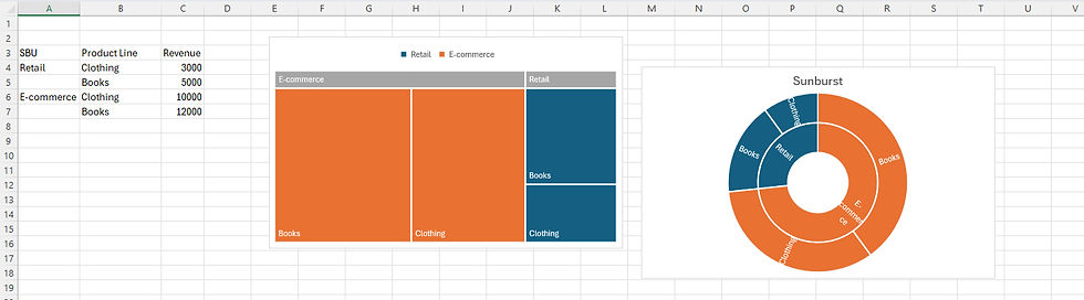

Fortunately, most of this is pretty streamlined in terms of what you need to do, which is mostly Insert, All Charts, Select Chart. Hopefully, you can see the use of these graphs types as well for visualizing segmented revenues and such.
If you found this helpful or enjoyable, please consider subscribing to our newsletter for more.
Comments